The latest coronavirus figures in Falmouth and Penryn
By Joseph Macey 16th Sep 2021


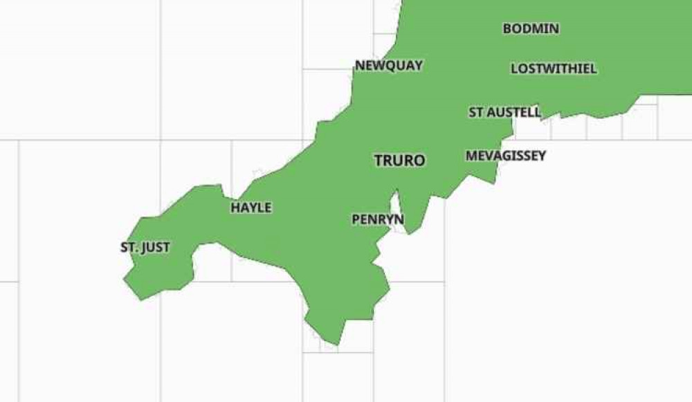
Falmouth & Penryn residents can now easily see how many Coronavirus cases there are in the area.
A government interactive map has been launched which is accessible to everyone.
The map uses official data to show the extent of Covid-19 in every area of the country within the past seven days. It is updated with new figures every day.
It shows:
- The number of cases in the past seven days
- The rate of infection per 100,000 people in the population
- How the area compares to the rest of England
Coronavirus in Falmouth
Mylor Bridge and Flushing: 7 cases
Penryn: 4 casesPonsanooth, Mabe and Constantine: 10 cases
Data for Falmouth East, Falmouth North, Falmouth West and South.
(Zoom in on the map and you can see the road names.)
Level rates are suppressed where there have been fewer than 3 cases in a seven-day period. This is to protect the privacy of individuals.
This gov.uk interactive map has a high reference point of 400 cases per 100,000 – an illustration of how the virus is spreading across the country.
You can view the interactive map for yourself here.
[H3] Don't forget, you can see all the latest news and join in on the conversation on our Twitter and Facebook pages. [.H2]
CHECK OUT OUR Jobs Section HERE!
falmouth vacancies updated hourly!
Click here to see more: falmouth jobs
Share:


